What CEOs Should Learn From an Expensive Market
When public markets pay extreme prices for future growth, private-company boards start making assumptions dangerous to a durable business.

I keep hearing that U.S. equities are expensive on a price-to-earnings basis compared with historic P/E ratios. The explanation I heard the other day was that investors are just pricing in future earnings.
That explanation sounds clean. It also sounds like one of those explanations that gets repeated because it feels sophisticated, not because the person has seen the math.
As a CEO you develop a pretty effective B.S. detector because you are ultimately responsible for areas far outside your domain expertise, and you need to know when to bring in outside rigor because something feels off.
Needless to say, my B.S. detector went off. As a board member and CEO you have to really care about stock price since it’s what your investors (and colleagues/employees) really care about.
So I pulled the data, built the models, sent the answer through a series of adversarial checks, and made the agents keep refining until my understanding truly converged. The project started as a tax and dividend question, wandered through buybacks, acquisitions, valuation history, discount rates, profit shares, superstar firms, monetary aggregates, cross-country panels, and forward-return models, and eventually landed on the question I actually cared about:
Why are equities so expensive? What should Boards and CEOs do (differently) because of it?
The answer is annoying in the way useful answers often are.
The market is not mostly pricing in future earnings growth.
The market is pricing a lower expected return, on top of a profit base that really did get larger.
Those are very different claims.
Results Up Front
This is long, and I do not expect most people to read the whole thing. The rest of the post tells you how I got here. And caveat lector, the research run was current as of June 3, 2026.
The decision-useful version is this:
U.S. equities are expensive by almost every long-history gauge. CAPE (Cyclically Adjusted Price-to-Earnings ratio which indicates if the stock is over- or under- valued) sits in the 90th-plus percentile of history. Corporate equity value relative to GDP is also in the 90th-plus percentile. Dividend yield says the same thing. The one big exception is total shareholder yield, because buybacks replaced dividends as the dominant way companies return cash.
The common explanation, “the market is pricing in future earnings growth,” mostly fails.
The major valuation drivers are:
Note that most of those drivers are strongly influenced by public policy: interest rates, corporate tax rate, and if whatever grand bargain Society reaches in the AI age results in some form of employee compensation or safety net (I wrote about this last week).
I did draw conclusions on how to better run a company based on the actual data. I’m going to leave those at the end of the article since if you’re running a company, you have a fiduciary duty of care that means you don’t get to read the cliff notes version.
Nothing in this post is financial advice. It is a research project trying to replace a vague story with data driven conclusions.
What I Measured
The project used only free public data. That constraint matters because it forced the study to separate what could be measured cleanly from what would require buying CRSP, Compustat, I/B/E/S, MSCI, and deal databases.
The core datasets were Shiller’s long U.S. valuation data, Damodaran’s implied ERP and payout data, FRED and BEA corporate-profit series, the Fed Z.1 accounts, World Bank market-cap/GDP data, the Jorda-Schularick-Taylor macrohistory panel, and a firm-level earnings panel built from SEC EDGAR XBRL frames.
The workflow became iterative as I became less dumb on the topic:
First, confirm that equities are actually expensive.
Then test whether high valuation predicts future earnings growth.
Then decompose the discount rate.
Then test whether the earnings base actually changed.
Then test money supply.
Then test composition and concentration.
Then test the international/historical base rate.
Then try to break the answer with side projects and adversarial verification.
The adversarial checks mattered. Several first-pass conclusions were softened or corrected. The profit-base story changed from “mostly tax” to “roughly equal margin and tax.” The German market story got corrected. The profit-share durability question got pushed all the way to the free-data wall and came back unresolved.
That is what should happen in a real research project. I learned how to ask the questions better, then learned better answers.
Finding 1: Yes, Equities Are Expensive
Before explaining anything, the first question was whether the premise was true.
It is.
The U.S. market is expensive by almost every deep-history gauge:
CAPE was about 28 in the full-year long-history snapshot, versus a historical median around 16; later sensitivity runs put it in the low 30s. Either way, it was historically high.
Corporate equity value was about 157% of GDP in the long FRED-based gauge, versus a median around 69%; the latest cross-country market-cap/GDP snapshot put the U.S. around 216%.
Dividend yield was about 1.7%, versus a historical median around 4.1%.
Earnings yield was about 3.5%, versus a historical median around 6.2%.
Those are 90th-plus percentile readings.
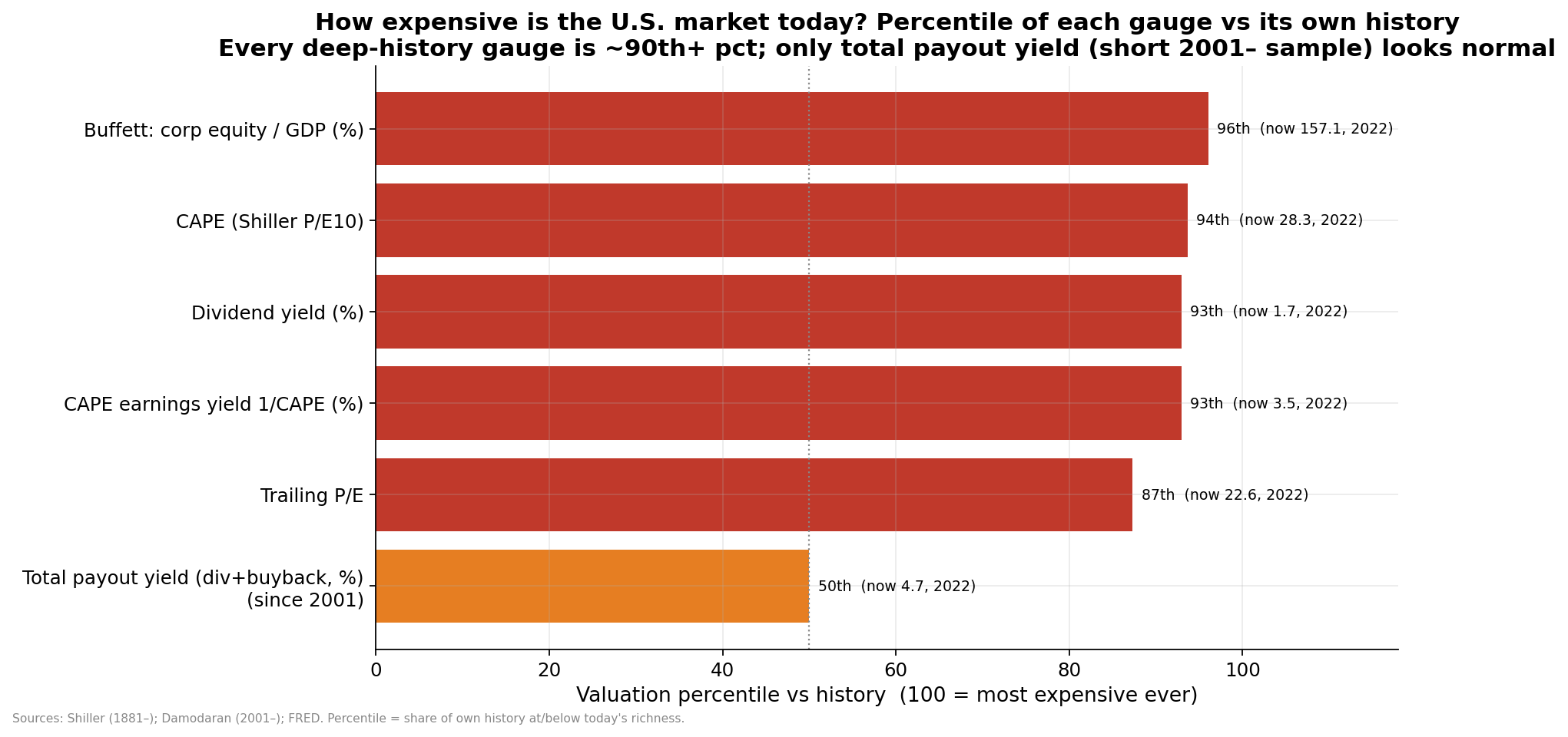
The cross-country picture says the same thing with a caveat. U.S. market-cap/GDP is extremely high, but market-cap/GDP is a noisy cross-country gauge because it is distorted by listing structure, financial-system structure, and foreign revenue. Much of the U.S. economy is publicly traded on stock exchanges. Germany, not so much. That does not make the U.S. cheap. It means market-cap/GDP is a useful warning light, not a clean country-ranking machine.
The one metric that did not scream “extreme” was total shareholder yield: dividends plus buybacks. That was around its 2001-2022 median. That matters because the dividend yield alone is partly lying to us. Companies did not simply stop returning cash. They relabeled a large share of it from dividends into buybacks.
That was the first clue.
The market is expensive in the capitalized value of earnings and GDP, not because cash return to shareholders vanished.
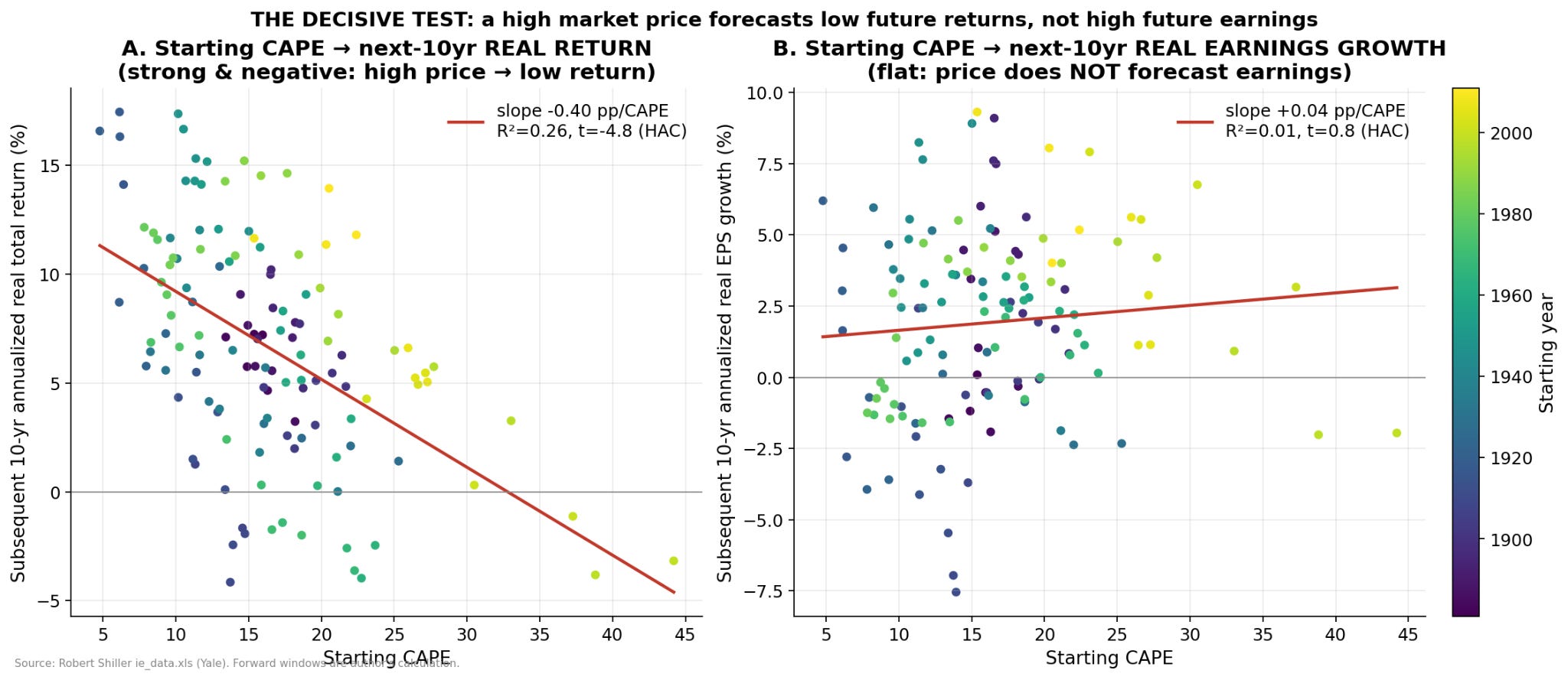
Finding 2: High Valuation Does Not Predict High Earnings Growth
This was the decisive test.
If the folk explanation is right, high CAPE should forecast high future real earnings growth. That is the claim hiding inside “investors are pricing in future earnings.”
It does not.
Across the long U.S. dataset, starting CAPE explains essentially none of the next decade’s real earnings growth. The R2 is about 0.01 (explains only 1%). The t-stat (measures real signal vs noise) is about 0.8. That is not a hidden signal. That is noise.
Starting CAPE does predict future real returns. The R2 is about 0.26 over 10-year horizons, and the sign is exactly what valuation theory says it should be: higher starting CAPE, lower future returns.
The result gets stronger with horizon. At one year, valuation is a weak predictor. At five years, better. At ten years, meaningful. That is what you would expect if valuation is not a short-term trading signal but a long-horizon expected-return anchor.
The Bogle decomposition into quartiles makes this intuitive.
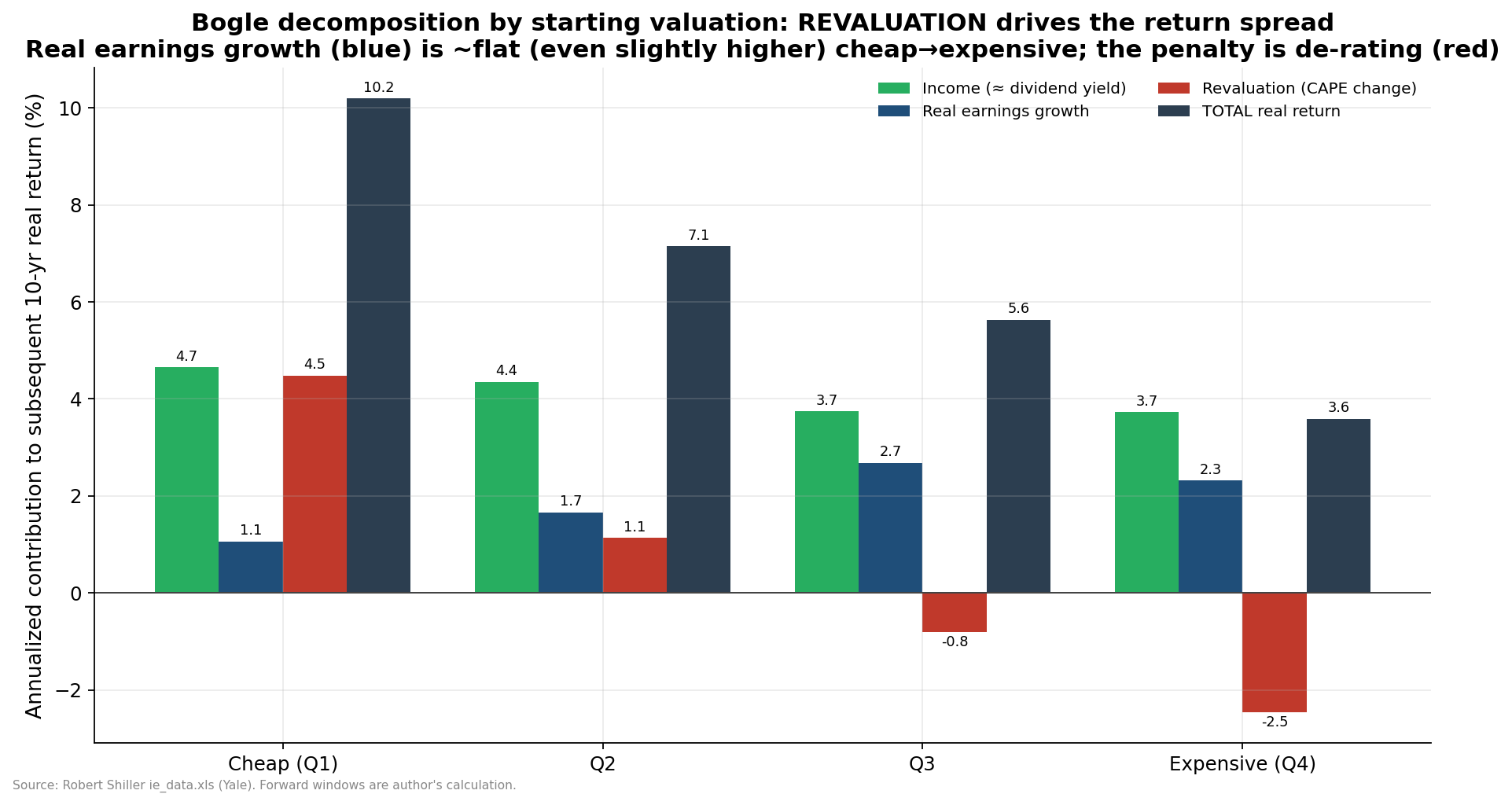
Cheap starting markets (Quartial Q1 in the graph) produced strong subsequent returns because investors got more income and multiple expansion. Expensive starting markets (Quartial Q4) produced weaker subsequent returns because investors got less starting income and multiple compression. Earnings growth was not the thing doing the work.
In fact, the expensive quartile had slightly higher realized earnings growth than the cheap quartile. Investors still earned much lower returns because they paid too much for those earnings.
That is the part people miss.
Great businesses can be bad investments at the wrong price. The whole market can do the same trick. Now I understand why Warren Buffet sat on the sidelines for so long.
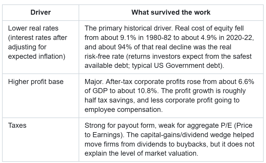
Finding 3: The Big Historical Rerating Was Mostly Real Rates
Once “expensive” becomes a discount-rate (the return investors require to own an asset) question, the next step is decomposing the discount rate.
The cleanest version used Damodaran’s measured implied equity-risk-premium series, not the lazy earnings-yield-minus-bond-yield residual that quietly smuggles valuation into the answer.
The result:
Real cost of equity was about 9.1% around the 1980-82 rate peak.
Real cost of equity was about 4.9% around the 2020-22 valuation peak.
About 94% of that decline came from the real risk-free rate.
The equity risk premium did not secularly collapse. It mean-reverted to historical norms.
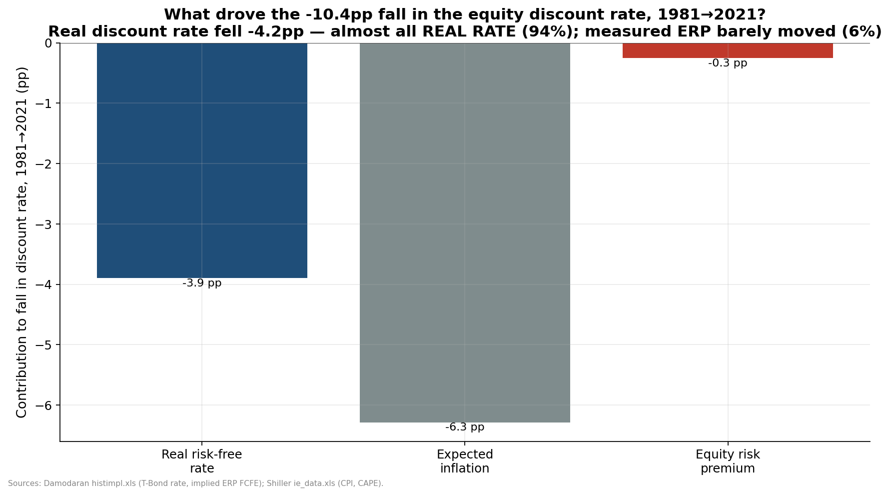
That distinction matters because it separates 1999 from 2021.
The dot-com peak was an equity-risk-premium compression event. Euphoric investors demanded very little premium.
The 2021 peak was more of a real-rate event. Investors still demanded a normal-ish premium, but they put it on top of a near-zero real rate.
Those are not the same bubble.
But there was a problem. Real rates rose again in 2023-25, and CAPE stayed high. A pure discount-rate model should have de-rated the market harder. It did not.
That is where the earnings base enters the story.
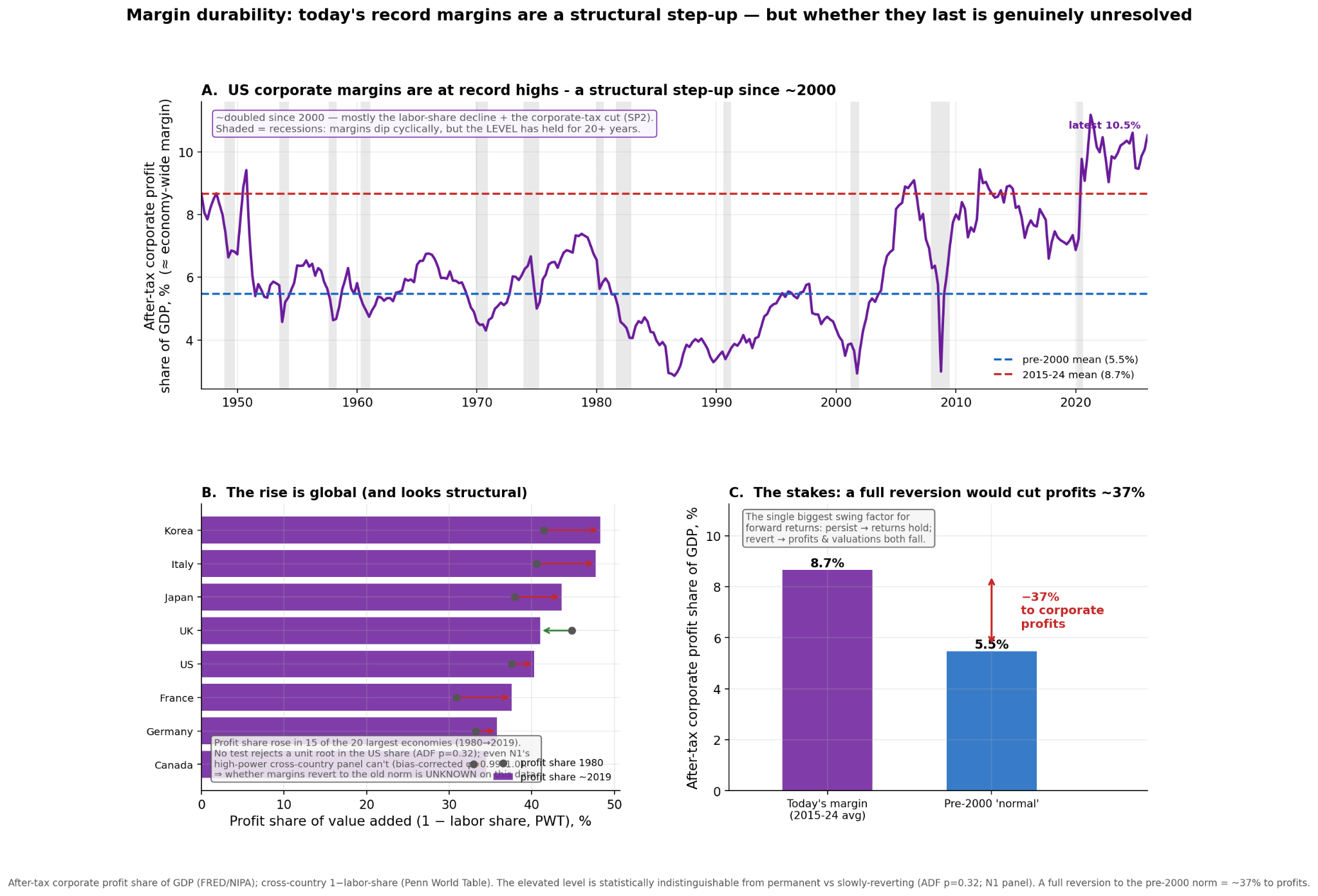
Finding 4: The “E” Actually Got Bigger
The strongest version of the skeptic’s argument is this: aggregate earnings cannot outgrow the economy forever.
Correct.
But they can outgrow the economy for a long time if the profit margin rises. That is exactly what happened.
After-tax corporate profits rose from about 6.6% of GDP in the early post-war baseline to about 10.8% in the recent period. Real after-tax profits grew about 3.2% per year from 1947 to 2025, versus real GDP at about 2.8%. The excess is not magic. It is a level shift.
The first-pass model said the rise was mostly a tax story. The deeper decomposition corrected that. The better answer is roughly equal between tax breaks, and the share of profit going to employee compensation.
That is an important correction.
Lower corporate taxes directly impacted share prices. Effective corporate tax rates fell dramatically. But the operating margin side mattered too, especially through labor share and market power. Capital took a bigger slice from labor and from the government.
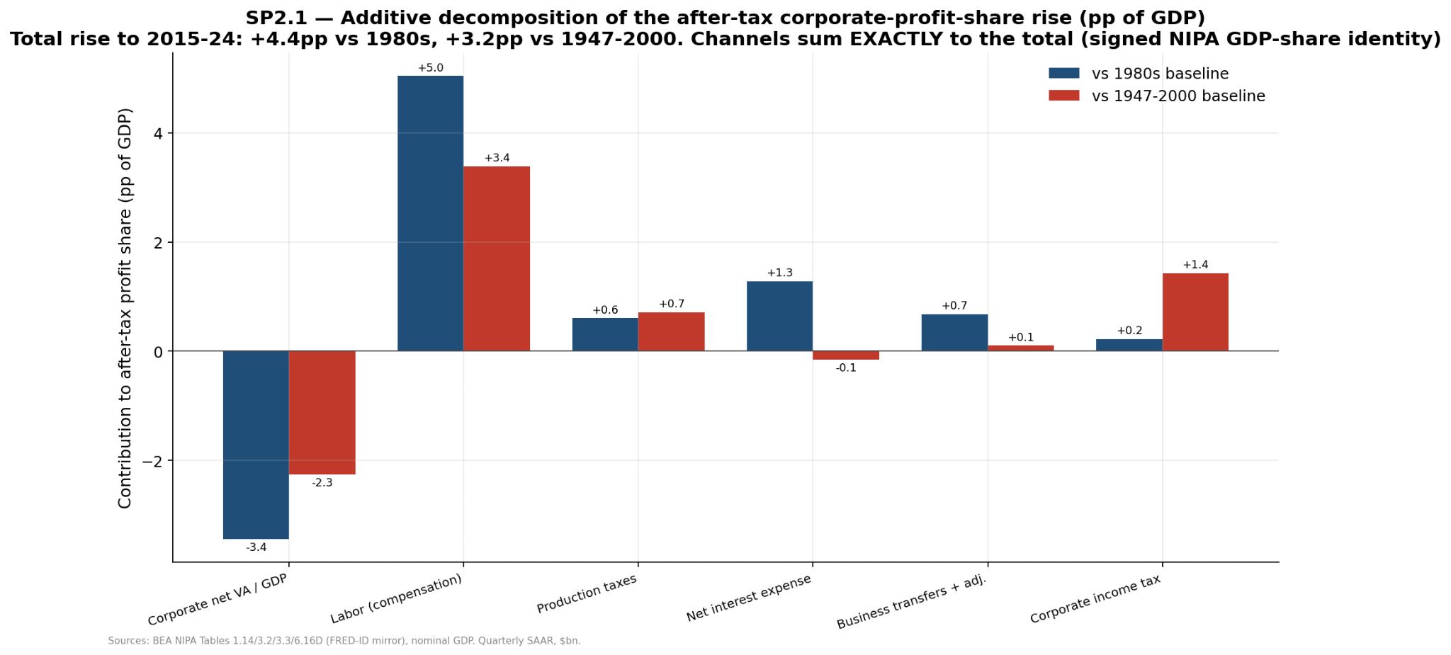
This resolves the paradox without validating the hype.
The higher profit base justifies a higher level of valuation than a naive 20th-century CAPE mean would imply. But it does not justify assuming earnings can compound faster than the economy forever. The corporate profit share cannot exceed 100%. Tax rates cannot fall from the current research-run level by another 30 percentage points. Globalization cannot be discovered twice. Buybacks cannot shrink share counts below zero.
These are bounded level shifts.
They raise the level.
They do not create perpetual escape velocity.
Finding 5: Money Supply Was in the Story, but Not the Way People Think
I also wanted to test the monetary explanation because it feels directionally right.
From 2008 to 2022, M2 (measure of the money supply: cash, checking deposits, savings deposits, money market funds, and other very liquid money-like assets) rose about 2.6x. The Fed balance sheet rose about 3.8x. CPI rose only about 1.4x. A lot of money did not show up as consumer-price inflation for a long time. The pattern is consistent with money working through asset prices and rates.
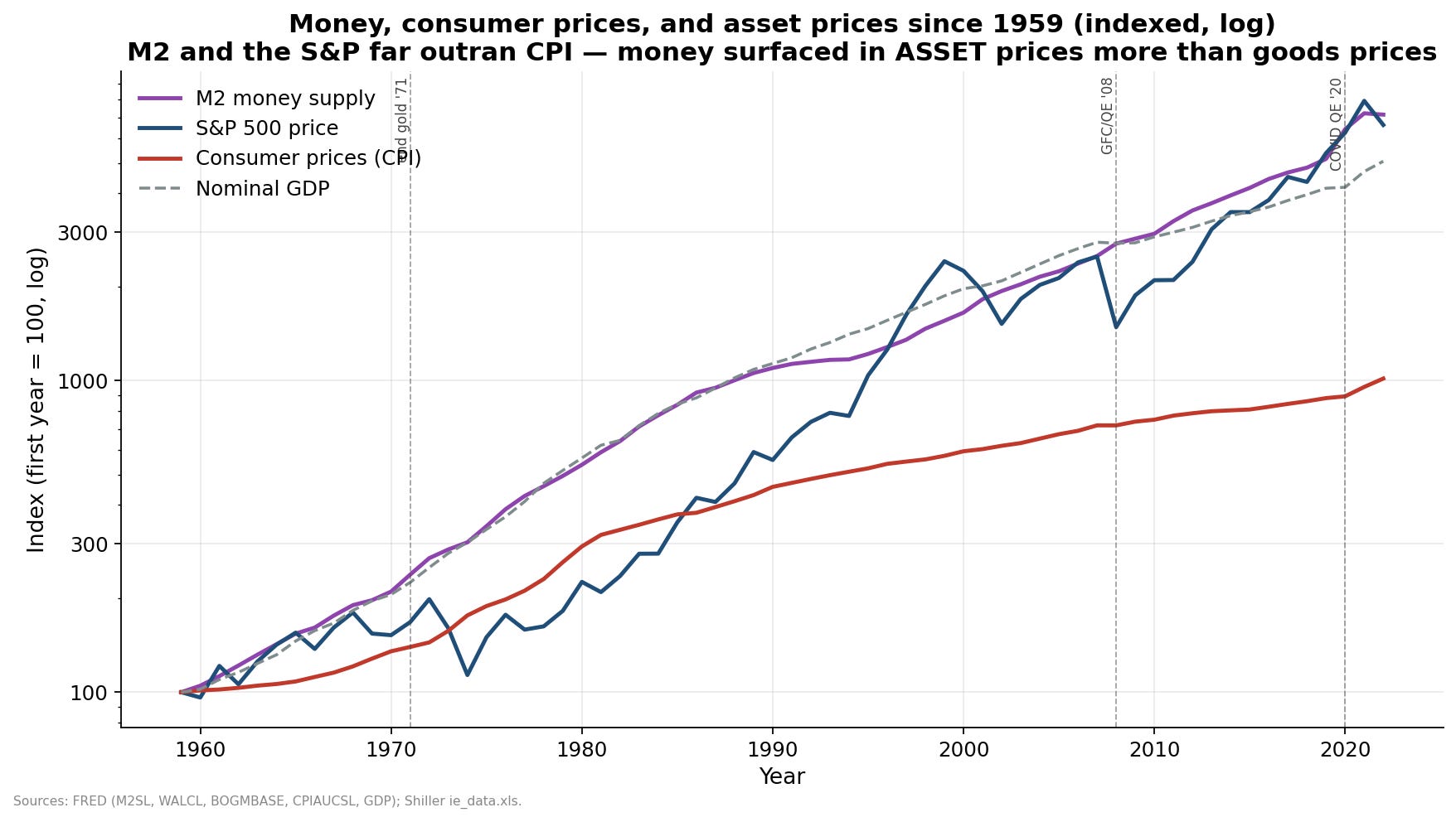
So yes, money mattered.
But when the model controlled for the real rate, excess money added essentially nothing. The R2 stayed about 0.136. The incremental R2 was basically zero.
That is the gate test. If money has an independent real-valuation channel beyond rates, it should show up there. It did not.
The best reading is:
Low inflation supports high P/E.
QE (Qualitative Easing) pushed into asset prices and lower real rates.
Money worked through the discount-rate channel.
Money did not independently make real earnings grow faster than real prices.
This is one of those places where a folk explanation is not crazy. It is just imprecise.
“Money printing made stocks expensive” is too blunt.
“Monetary policy helped suppress real discount rates, which raised asset values” is closer.
Finding 6: The Index Became a Different Animal
The composition story also survived, but it did not become the whole story.
The SEC EDGAR firm-level panel showed earnings concentration rose. The top 10 firms earned about 21% of total positive earnings in the early comparison window and about 28% by 2024. S&P 500 top-10 market-cap weight rose from about 18% to about 37%.
That means mega-cap dominance is not pure hallucination. A lot of it was earned.
The deeper firm panel sharpened the point: concentration rose in profits and R&D, not revenue. The superstar firms do not just sell more. They earn more. Their margins diverged.
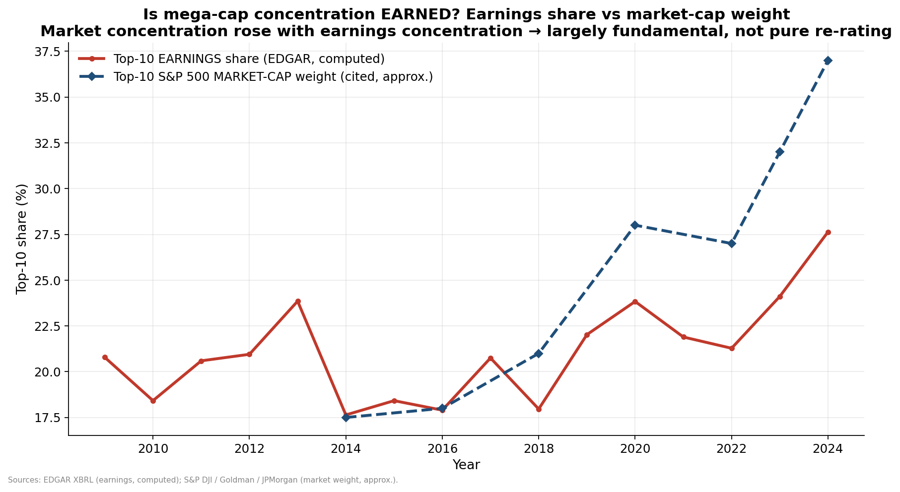
But composition is not enough to carry the whole valuation story. A stylized sector-mix decomposition put the pure mix effect around one-fifth of the CAPE rise. The rest was broad re-rating.
That is the right scale.
The market is partly more expensive because it is a better, more profitable, more global, more capital-light index. But most of the rerating still has to be explained by lower discount rates and a higher profit base.
[And five of the top-10 mega-cap companies are now plowing capital into data centers and GPUs now so they are ceasing to be capital-light.]
Finding 7: The Original Tax Hypothesis Was Right in the Wrong Place
The research project started with a different hypothesis: maybe the tax preference for capital gains over dividends pushed firms away from dividends, into buybacks and acquisitions, and lifted valuations.
That hypothesis partly survived, but not where I expected.
The tax wedge is real. The statutory dividend penalty mostly disappeared in 2003 when qualified dividends were taxed at capital-gains rates, but the structural advantage of capital gains remained: deferral and step-up basis. If gains are deferred until death and stepped up, the effective capital gains tax can be zero.
That is a real incentive.
It strongly explains payout form. Buybacks went from essentially zero before the 1982 Rule 10b-18 safe harbor to the majority of shareholder payout. Net equity issuance flipped into persistent net repurchases. Dividend payout ratios fell. Total payout stayed much more stable than dividend payout.
So the tax story explains the relabeling of cash returns.
It weakly explains aggregate valuation.
The timing is wrong, the real-rate confounder is too large, the equity ownership base became much less taxable, and cross-country tax wedges do not produce a clean valuation ranking. Taxes mattered for corporate behavior. They are not the main reason the whole market trades at a high P/E.
This was one of my more useful failures in the project.
The tax hypothesis was not wrong. It was aimed at the wrong dependent variable.
The Attribution That Survived
After all the stages, side projects, and adversarial checks, the attribution looked like this:
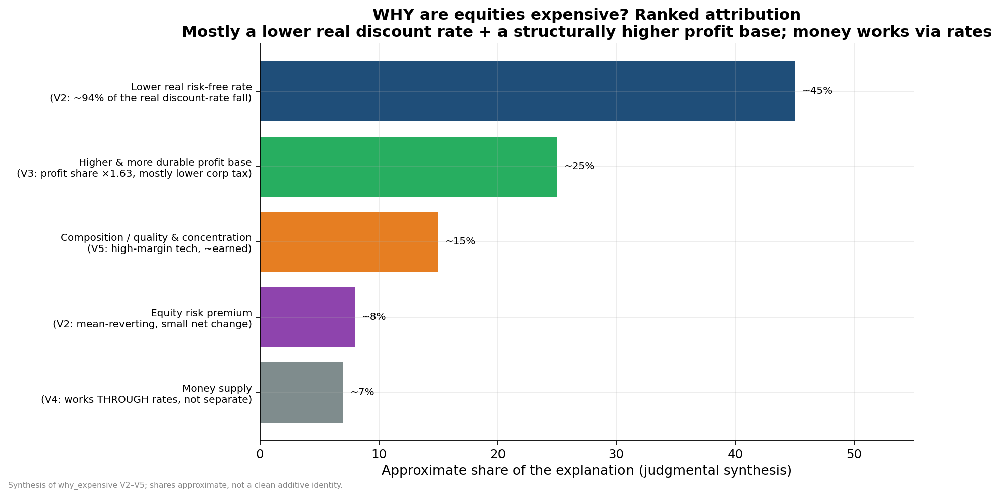
Do not treat those percentages like a clean physical identity. They are a synthesis across different parts of the valuation equation, not one regression with perfectly additive coefficients.
But the ranking is useful:
Lower real rates are primary.
The higher profit base is major.
Composition is meaningful but secondary.
The equity risk premium is not the main story.
Money works through rates.
“Pricing in future earnings growth” is the wrong description for the aggregate market.
Where the Data Stops
The project eventually hit a wall, and the wall is important.
The central unresolved question is not “are equities expensive?” They are.
It is not “does valuation predict future earnings growth?” It does not.
It is not “did the profit base rise?” It did.
The central unresolved question is whether the elevated profit share is durable.
That is the forward-return hinge.
If the higher profit base persists, the June 2026 valuation level is much more defensible. It can still imply low returns, but it does not require an immediate collapse. If the profit share reverts, expected returns are materially lower.
We attacked this several ways. The U.S. time series could not distinguish permanent from slowly mean-reverting. The cross-country panel had more power, but after correcting dynamic-panel bias it also could not resolve the U.S.-relevant common factor. The best honest answer was that the question is statistically unidentifiable on free data.
That is unsatisfying. It is also the answer.
The durability bet decomposes into three practical risks:
Margin/labor-share reversion (employees make a larger share of the profit).
Tax-policy reversal.
Rates and net-interest normalization.
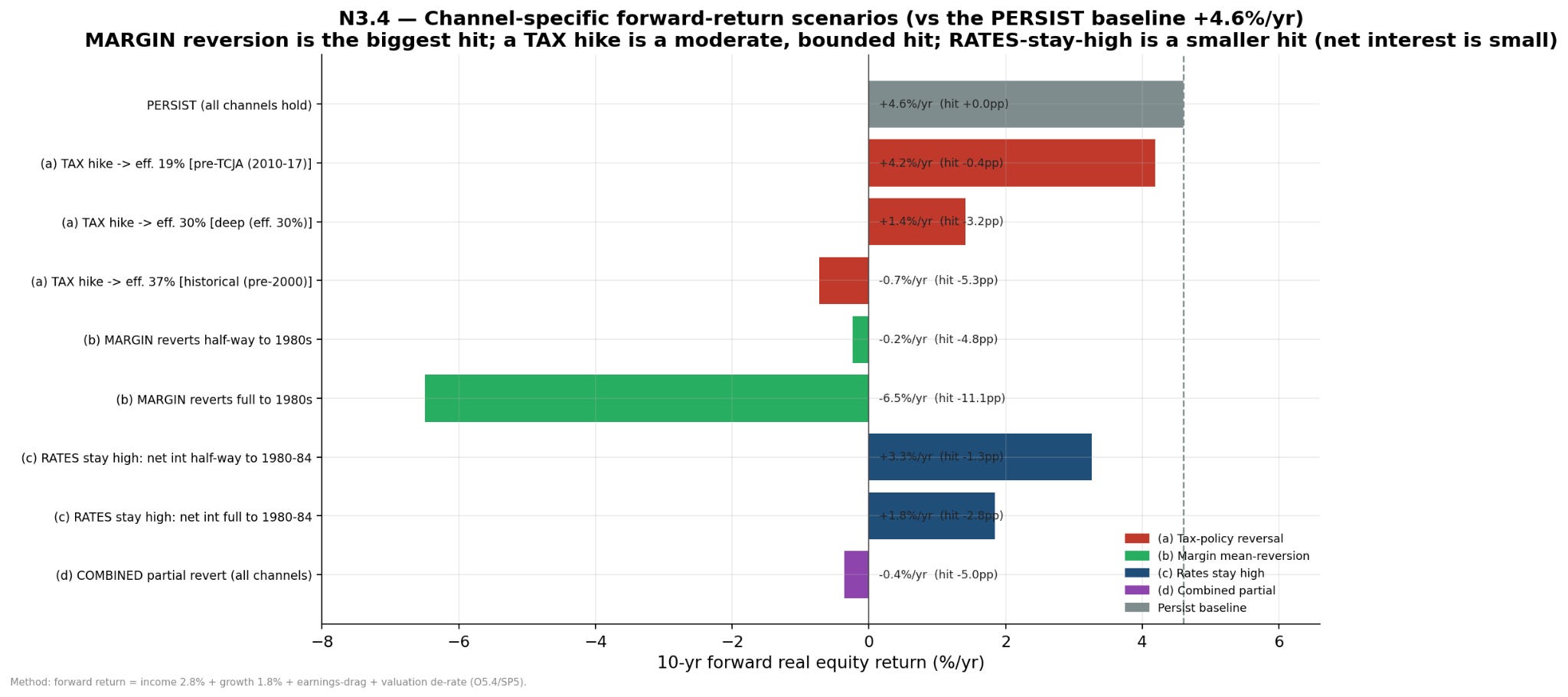
The biggest identifiable reversion risk is if society’s eventual grand bargain with AI moves money to employees pockets from corporate profit. A tax reversal is also material. Rates matter, but less than the margin and tax channels for this specific profit-share durability question.
Those are all driven by public policy. Much of the run-up in the stock market derives from past changes in the law and regulations. If/when our democracy chooses to change policy again, then the changes will also affect peoples’ 401k accounts. Those changes can move in either direction.
How I Would Use This Knowledge When Running a Company
This is where the research stopped being an equity-market project and became a boardroom project.
The core lesson is “stop managing the company as if today’s valuation environment proves your strategy.” Today’s valuation environment proves yesterday’s public policy priorities.
If I Were Running a Private Business
For a private business CEO, the biggest mistake would be importing public-market logic into a private company that does not have public-market liquidity.
When public multiples are high, everyone downstream starts behaving as if terminal value is free. Private-company owners hear higher EBITDA multiples. Founders hear that buyers will pay for growth. Boards hear that strategic scarcity matters. Lenders and investors underwrite exits using comps that may already embed low expected returns.
That is dangerous.
If I were running a private business, I would do four things based on this project’s data:
First, I would run the plan on cash yield, not just exit multiple. The public market can accept a lower return because the buyer has liquidity, diversification, and daily pricing. A private company owner does not. If the business cannot generate cash at an attractive yield to the actual owners, I would not let a spreadsheet terminal multiple rescue the strategy. Or more succinctly, Cash is still King because the valuation multiple is too much a function of public policy.
Second, I would raise the bar for “growth.” Growth is valuable when it creates durable cash flow at good incremental returns. Growth is not valuable merely because revenue went up. This project kept finding the same distinction: the market rewards durable profit bases, not just activity. For a small company that means pricing power, customer retention, gross margin, low churn, operational repeatability, and a sales motion that does not require heroic founder intervention.
Third, I would treat labor productivity as a strategic project. The biggest unresolved valuation risk is how much profit goes into employee compensation vs corporate profit. We can manage this risk by focusing on increasing employee productivity. More output per person to grow into more market share. That results in both higher compensation, and higher corporate profit. Tactically, I would look hard at every workflow where hiring more people has become the default answer. AI matters here, but not as a bumper sticker. The question to ask is how to increase output per person, instead of increasing people to increase output.
Fourth, I would make the board packet more macro-aware without turning it into a macro meeting. I would add a simple page that shows:
Revenue growth versus gross margin.
Headcount growth versus output.
Pricing changes versus wage and vendor inflation.
Cash conversion, not just EBITDA.
Debt repricing dates and liquidity.
A downside case with lower exit multiples.
Those are the macros that a business can control. A small board does not need a forty-page macro deck. It needs to not confuse a high-comps environment with proof that the business is compounding intrinsic value.
If I Were Running a Public Business
I have never run a public business, and all of my mentors who have run a public business swear they’ll never do it again. So I’m gonna limit myself to reading the data.
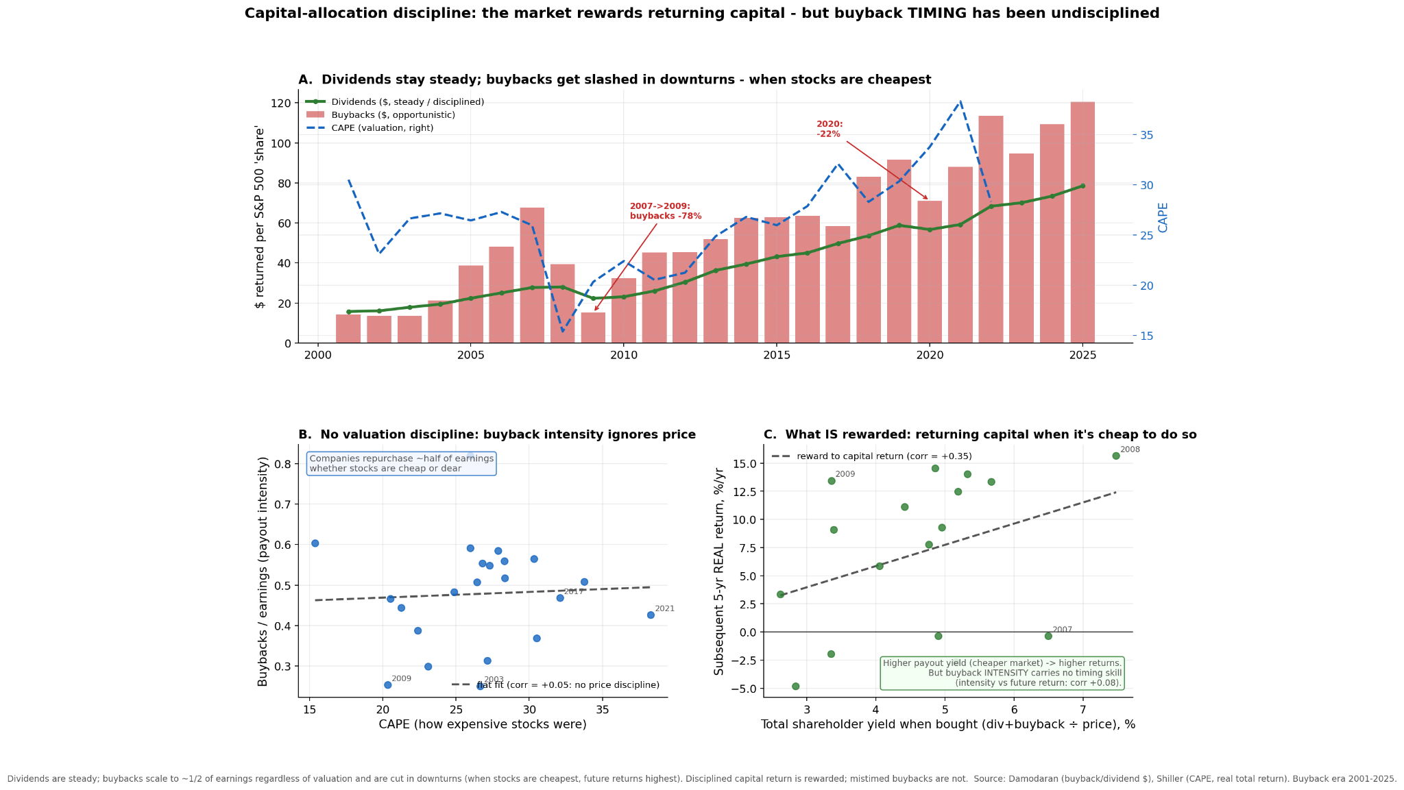
First, the market rewards capital allocation discipline. In the top graph, we see dividends rise steadily and barely dip; but buyback dollars are volatile and were slashed hardest when stocks were cheapest (CAPE 15–20) and the next-5-year real return was highest (+13–16%/yr). On the left graph we see companies buying back their stock regardless if the price is cheap or expensive. The right graph is the lesson: higher total shareholder yield (returning capital when it’s cheap to do so) predicts higher subsequent returns (corr +0.35), but buyback intensity itself shows no timing skill (corr +0.08). So the reward is for returning capital at a good price, not for buying back per se.
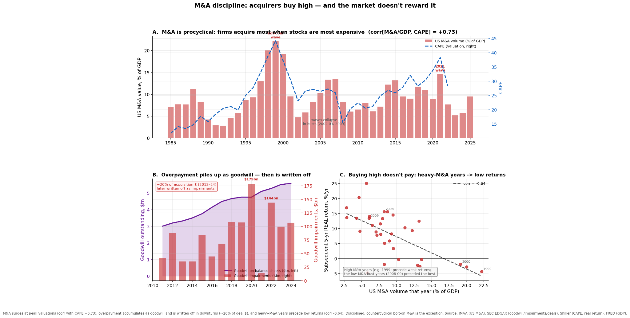
Second, the market rewards M&A discipline. In the top graph, we see that companies acquire most when valuations are expensive. In the left graph, we see how M&A valuations appear on the acquirers balance sheet as goodwill and 20% is ultimately written off as impairment. And the right graph is the lesson: the market doesn’t reward buying high. Heavy-M&A years are followed by low subsequent real returns and the low-M&A bust years preceded the best. I don’t otherwise have data to show the difference between a good M&A and those which end up as write-offs.
Third, margins are heavily influenced by public policy. On the top graph we see a post-2000 step increase in corporate profits that are mostly a decrease in profit allocated to employee compensation and corporate tax changes. On the left we see it is a global change. And on the right we see how much of the profit margin depends on these external factors. The margin and thus the stock price are heavily influenced by public policy. Corporations are heavily incentivized to get involved in politics.
Fourth, be careful around investor communication. Much of your share price derives from public policy which you do not control. If you communicate that your share price is based on forward revenue, and public policy change lowers your stock price, then your investors will hear your future revenue expectations are lower. That’s a double whammy. Stake your claims on something you can control.
The Bottom Line
The clean dinner-party explanation is wrong.
U.S. equities are not expensive mainly because investors have magical visibility into future aggregate earnings growth. High valuation has historically forecast low future returns, not high future earnings growth.
The better explanation is:
The real discount rate fell globally. That mechanically raised the value of long-duration cash flows. At the same time, the after-tax corporate profit base rose through a bounded mix of higher margins, lower labor share, lower corporate taxes, global revenue exposure, and buybacks. The index also became more concentrated in firms that genuinely earn more. Money supply helped through rates. Taxes helped reshape payout into buybacks, but they were not the main P/E engine.
That combination makes the current research-run valuation partly justified and still expensive.
The most honest forward-looking statement is conditional. If the elevated profit share persists, U.S. equities can grind out low real returns from a high plateau. If margins or tax rates mean revert, the valuation support weakens. If multiples revert too, returns can be negative.
That is the thing to internalize.
Expensive does not mean the market knows earnings will boom.
Expensive means the market has already accepted a lower return.