
I’ve been analyzing Chinese corporate filings for a while now because most accountants don’t understand OPSEC (operational security). They’re both incredibly boring to read and wonderfully insightful about Chinese industry. My first automated filing analysis pipeline broke on an image embedded into a quarterly report. It’s an easy fix: wire up a visual LLM to turn the images into a text table (Qwen is really good at this for Chinese characters). But it made me wonder: if a company embedded its bad news as a picture in a regulated financial filing, would that hide the data from market automation while satisfying the human regulators? It certainly was hiding data from my initial analyses.
Bottom Line Up Front
Chinese listed companies do embed adverse numbers in pictures, and the statistics are insightful. If we look at periodic reports from firms that are not under regulator scrutiny, images of tables included derogatory information 31.3% of the time, whereas text-based tables included derogatory information 17.1% of the time. The ratio is interesting.
The clearest single example is a Chinese manufacturer that we’ll call Company D. Its FY2018 annual report embeds fourteen substantive images; the year before, one. The picture that matters is the year-end list of accounts receivable being written down as bad debt. That means Company D judged those debts unlikely ever to be collected. There were six bad debtors, and the image of the table listed every reason cell as 涉诉 (”in litigation”). The same table was ordinary text (not an image) in the FY2017 annual report. The same FY2018 document also carries 74 tables as ordinary text. FY2018 was also the year the firm’s net profit swung from +327.5 million yuan to a 1,046.9 million yuan loss. Let’s just round that to a $150 million USD loss. That’s the clearest example among 86 corporate filings that looked funny to me.
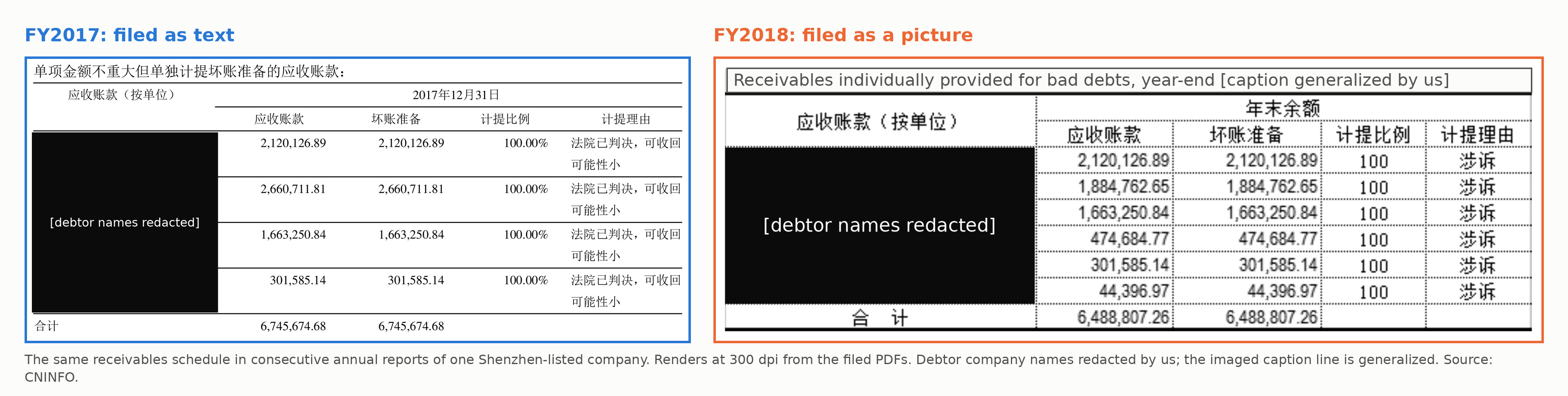
Left: the FY2017 table was ordinary machine-readable text. Right: in FY2018 the same table was an image, every reason cell reading 涉诉 (’in litigation’). We redacted debtor names.
The practice of embedding images of tables in a regulatory filing is common enough and mostly innocent. In a random sample of 400 listed firms, 1.26% of periodic reports carried an image of a table with derogatory information. Most of these images are spreadsheet exports pasted as pictures or screenshots of internal business systems. Intent is not observable from a filing. Most are benign. But taken statistically it is consistent with shenanigans, and also with a boring possibility that crisis-year sections get pasted by different people than in other years.
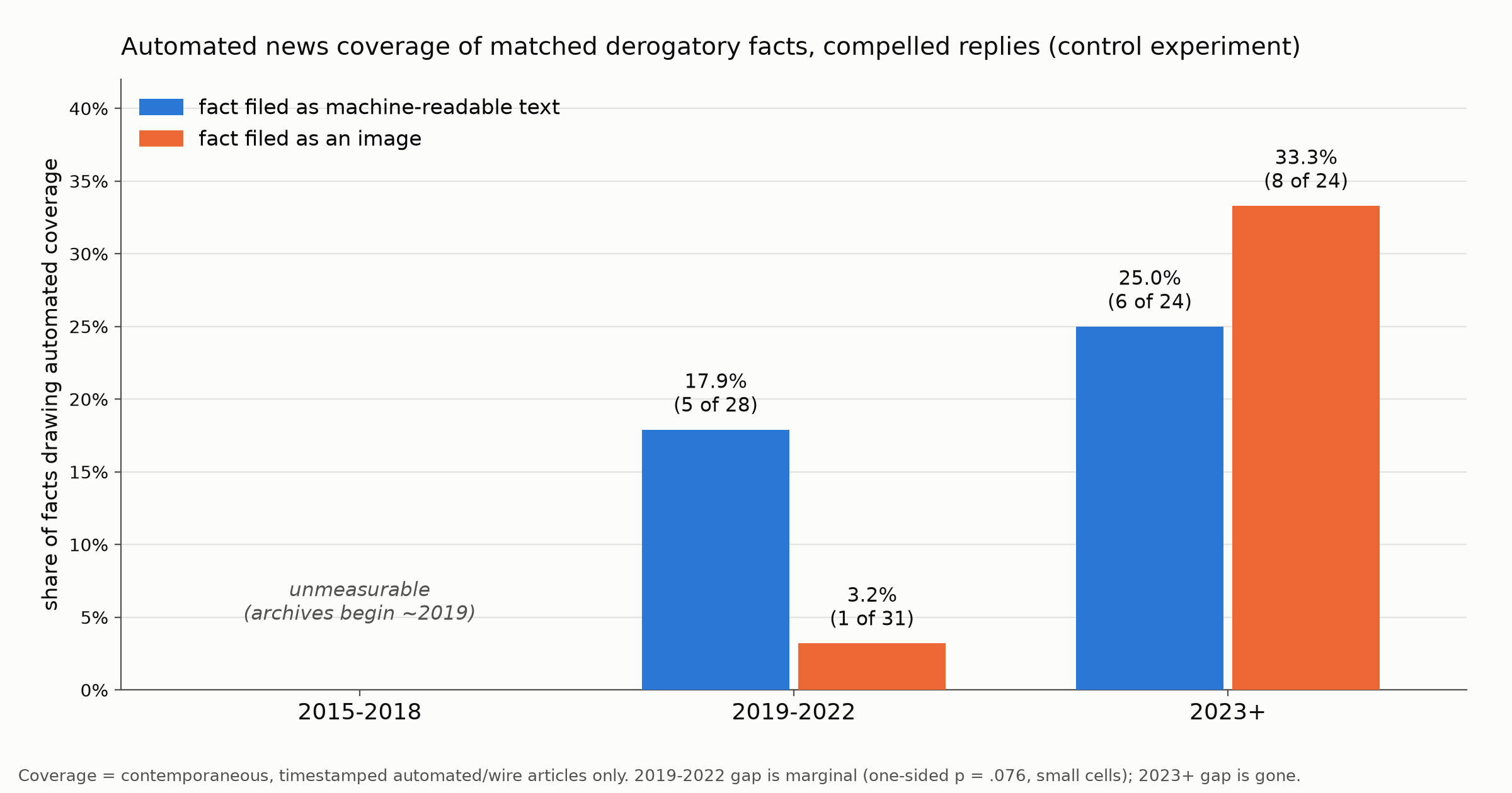
Here is the part that surprised me. Negative information “hiding” in an image did not detectably hide from the market. In companies where a regulator had compelled a response, “hidden image tables” actually drew slightly more trading volume not less (truth in statistics: the statistical range here includes zero, so take this with a grain of salt). But “hidden image tables” did seem to hide from the automated news tickers for a while. I only tested this in companies publicly under regulator scrutiny, and images of tables in a compelled response drew contemporaneous automated coverage 3.2% of the time versus 17.9% for machine-readable facts. That was only true through 2022; multimodal AI summarizers now mind the gap.
The research data was current as of 2026-08-18. Chinese filings quote figures in 万元 (wan yuan, units of RMB 10,000); one round rate for this post is RMB 7 to the dollar.
What we found
1. Fingerprints left in the images. If you look at financial filings long enough then you start to get a little loopy. Well, I do anyway. Look closely at imaged cells across this corpus and you’ll see Excel’s green error-triangles in the cell corners. You find Word’s line-break marks printed in the cells of a pasted image. The typeface changes at the picture’s border. I find this funnier than I should. But when an imaged table’s tool-marks and fonts don’t match the document around it, you are looking at an import from another program, which is exactly what the innocent account predicts. In aggregate, 57% of the images looked like spreadsheet or business-system screenshots pasted into the filing as pictures. That is the innocent workflow: someone builds the table in Excel or pulls it out of an internal system, and pasting a screenshot is safer than rebuilding the table in the document. These are regulatory filings, so mis-typing a number while transcribing it into a financial filing can trigger real penalties.
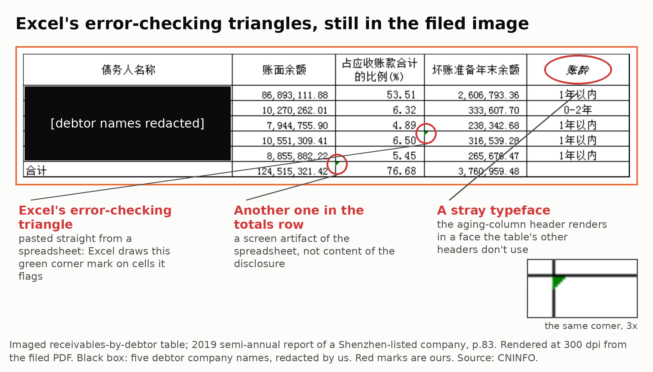
Excel’s green error-triangles inside a table filed as a picture (inset: 3x zoom), plus a header cell that came through in stray italics. The spreadsheet came along for the ride.
2. Some images look really funny. In the image below (right side panel), the imaged table is typeset like a table from the rest of the document: matching fonts, column rules, and spacing. That look is consistent with a different workflow: the table was built in the document like every other table, screenshotted, and then replaced with its own picture. Consistent with, but not proof of. A house Word template could produce the same look. But I’m not sure why someone would copy-and-paste an image instead of the actual table from Word to Word.
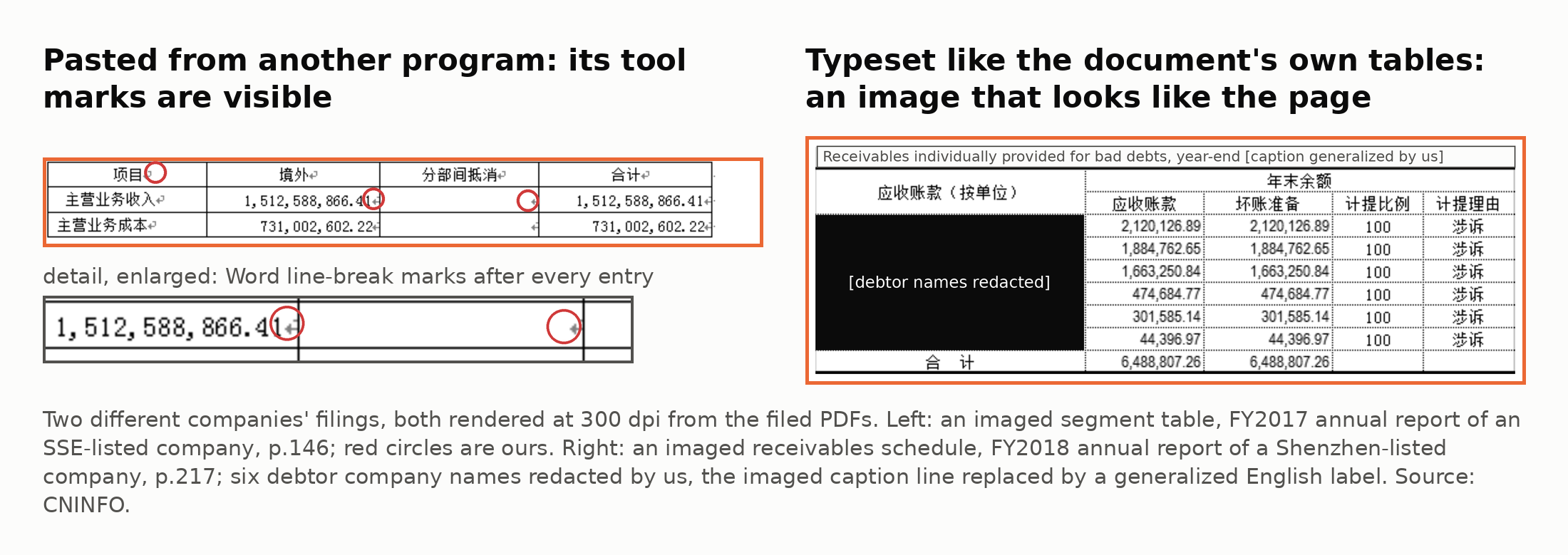
Left: an import with tool-marks gives the workflow away. Right: an imaged table typeset like a document table, hard to tell from its text siblings except that machines could not read it. The two panels come from different firms.
Company D’s bad-debt schedule is the second kind. The imaged schedule itself shows no tool marks (we even checked programmatically: there were zero non-gray pixels), it is typeset like a document table (fonts were consistent with the document’s own embedded Song and Times families), and give or take soft tells like dotted gridlines and a “100” where the prior year printed “100.00%”. That’s just the funny table. The other imaged table on the same page is the firm’s top-five receivables list and it has an Excel error-checking triangle in its totals row. I found this example by analyzing company filings over time and flagging when a table that had historically always been text suddenly flips into an image. This particular one was also filed months late after delay notices. And FY2018 was the year the firm’s annual report states its net profit fell more than 400%. It sure looks funny to my non-accountant eyes.
3. The market reacts to images of bad news anyway. If pictures actually hid bad news then machine-triggered trading should thin out. We couldn’t detect any. In the companies with exchange inquiries that compelled replies, imaged replies drew more abnormal trading volume (truth in statistics: the sample size is too small to state this is definitive). The market, as far as we could detect, could read the pictures of tables.
4. The pictures did fool the news bots for about four years. Then the machines learned to read images. We 1) matched 65 imaged derogatory facts against 65 machine-readable text facts from the companies where an exchange was compelling a response, 2) collected contemporaneous timestamped news coverage of the company, and 3) grouped them by technology era because a 2020 filing must be judged against 2020-era news pipelines. I didn’t have good news archives from before 2019. But in the 2019 through 2022 era of text-only news pipelines, imaged facts drew automated news coverage 3.2% of the time versus 17.9% for the pure-text filings (truth in statistics: 1 of 31 when the derogatory fact was in an image, vs 5 of 28 when it was text). The gap disappears in 2023. Again, this is a small sample size, but derogatory facts “hidden” in images resulted in more contemporaneous news coverage in the AI-generated news era.
How we know
The short version of the method: we built a census of China’s compelled-disclosure channel (74,675 documents since 2000), then screened a 10,019-reply probability sample, 3,963 periodic reports from the never-questioned population, and a 1,505-report random arm, all with the same instruments. Every counted item was transcribed and judged derogatory-or-not by two independent model seats validated against adjudicated gold sets; the designs and their bars were fixed before labelling; detector error rates are measured and on record (the two judging seats agree with the adjudicated gold at 0.986 and 0.957 on the periodic pipeline). Companies here are lettered, not named; the page facts are checkable against the public filings. If you believe any document fact here is wrong, write to me: I will check it against the preserved filing and correct this post if I’m wrong.
So where does that leave us? Some images of bad news embedded in corporate filings sure look funny. They broke my automated workflow so I went looking. Some of the pictures indicate a Microsoft office workflow, error-triangles and all. Some are typeset like the filing document itself and aren’t so easily explainable. We can’t adjudicate intent from the filings. But what we can measure: the bad news embedded in the pictures never detectably hid from the market, and since 2023 it doesn’t hide from the automated news feeds either. For at least four years it did seem to hide from the machines that automatically generated news from corporate filings. But today’s era of AI-based reasoning can read the images just fine. Mine does.